What ideas were explored?
We initially needed graphics for 3 sections which I titled 'Managing Gardens', 'View Ballot Status', and 'Neighbour Gardening'.
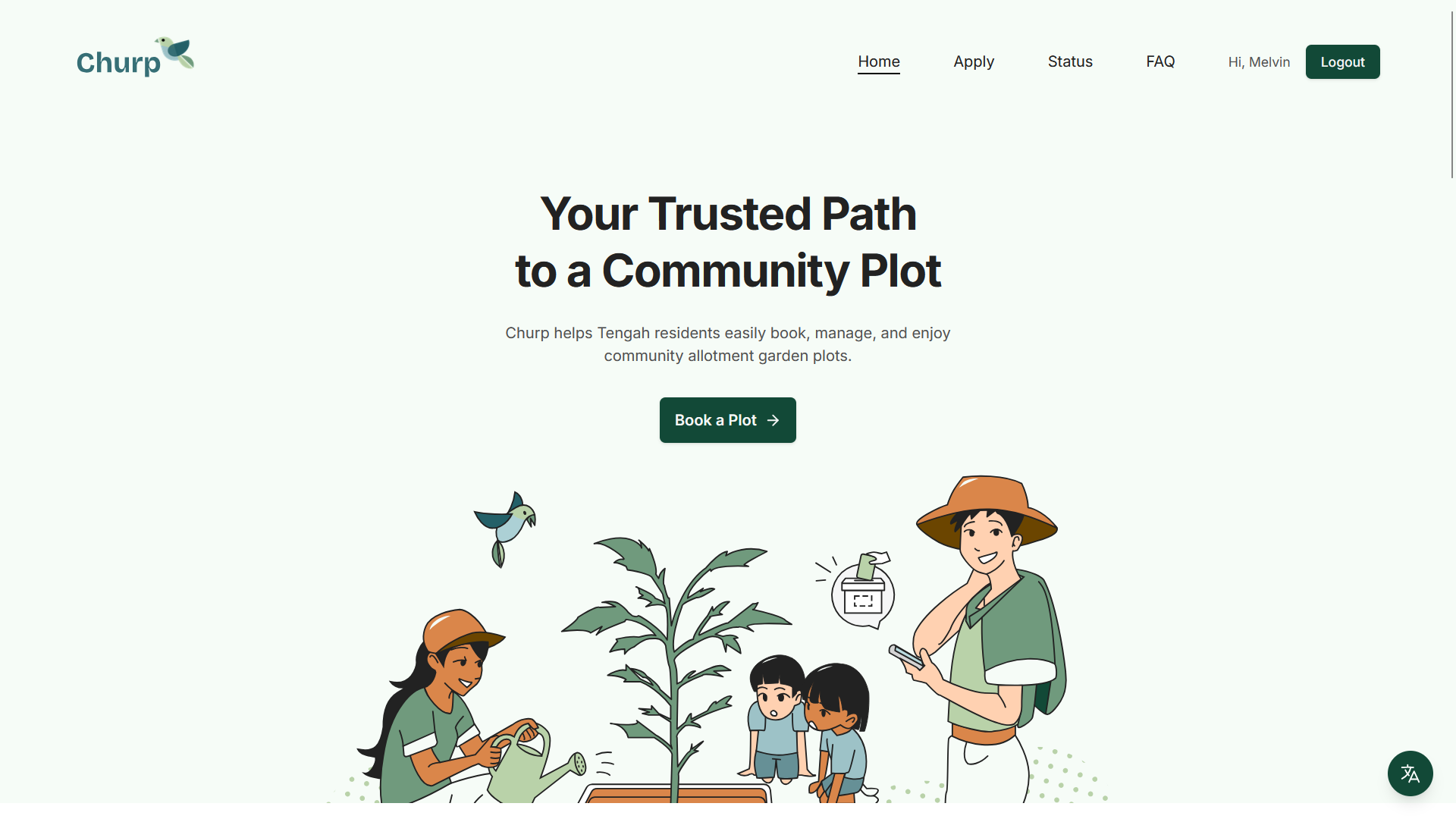
The 1st section was the most important since it was our hero image. It had to convey our purpose and personality succintly.
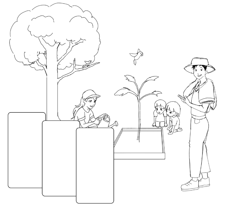
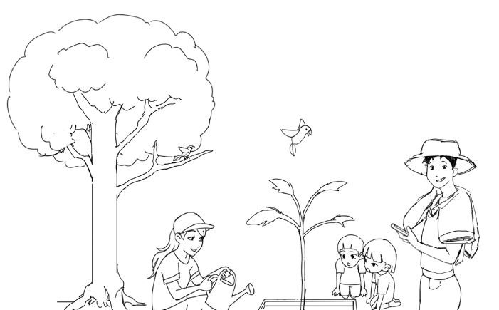
Initial exploration for that took me to drafting a garden scene with fences, grass on ground, and additional other details.
Further iterations removed many elements and added new ones such as children, phone in hand (representing the website), and the ballot box icon.
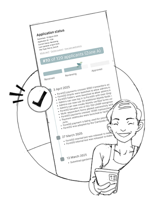
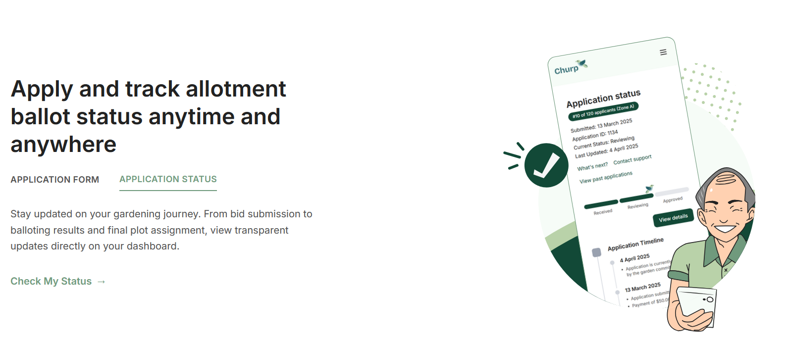
The second section would feature a snippet of one of our website's functions, 'View Ballot Status', so it had to be the main focus.
To balance out the composition, a person on his phone along with an icon was added.
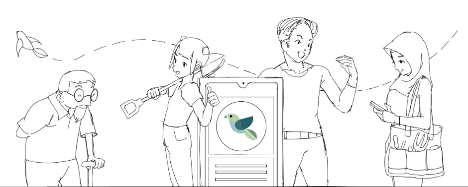
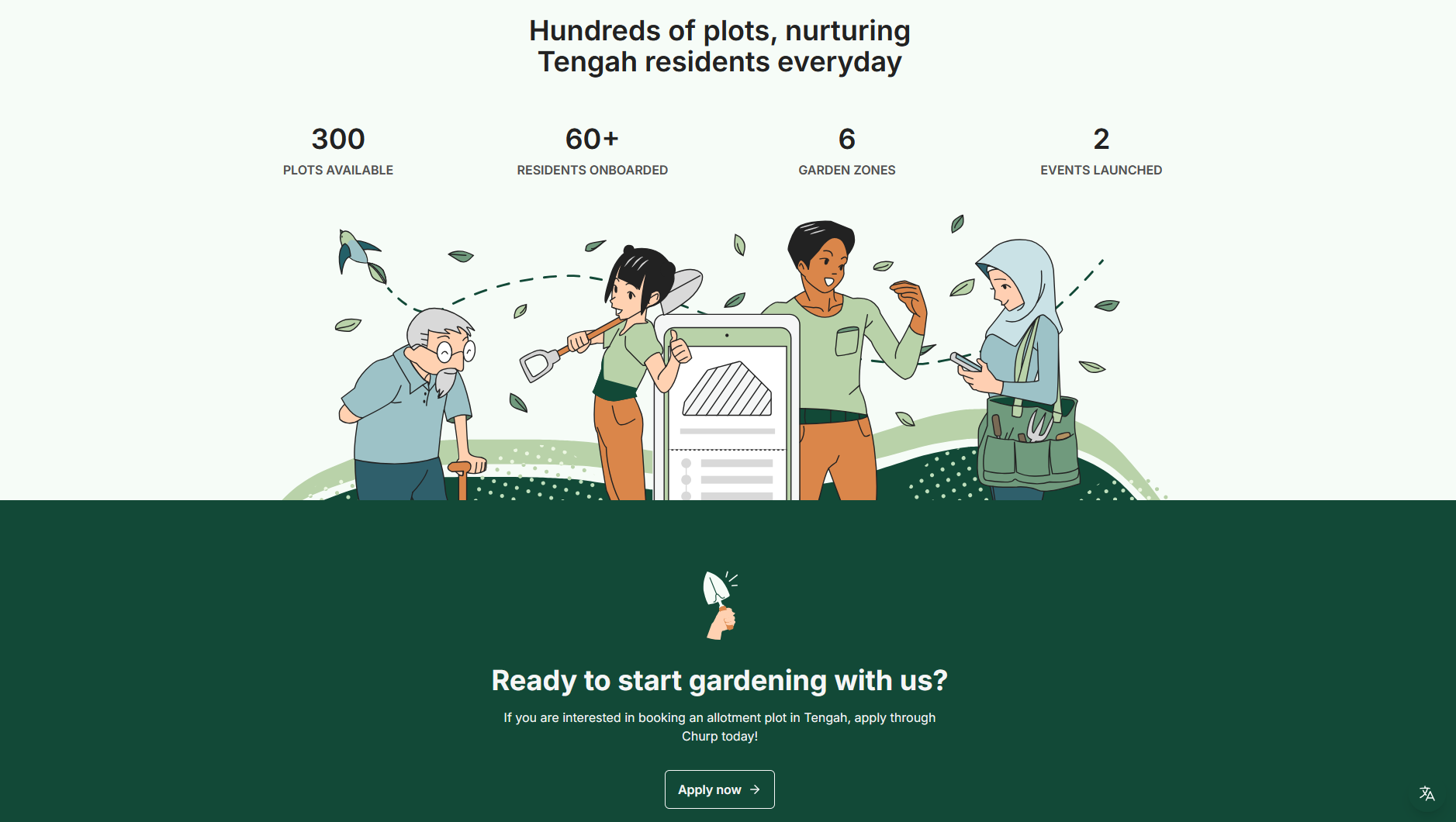
The third section was our call to action where the centrepiece would have to be our website. I represented this as a phone with our logo (a bird) on it.
People from different walks of life would be drawn to it, beckoning others to come over. A balancing element was the bird that flew an arc through the people, creating a "connection" both visually and thematically.